Impact of design
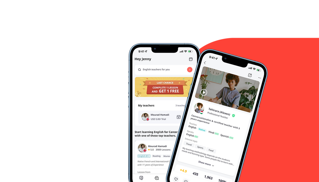


italki
Italki is one of the world's largest online language learning communities with more than 5M users, and 10,000+ teachers from over 200 countries teaching over 130 languages worldwide. The core feature is that students can customize private 1-on-1 lessons based on their goals and interests and pay for the lesson when they need it.
My role
UX/UI designer
Skill used
User Research, Competitive analysis, User journey map, A/B testing, Prototype, UI design
Team structure

Product manager x1 Front-end Developers x2
Back-end Engineer x1 QA x1
Time frame
Two months
Overview
Italki had 5M users in the community, but there are only 200K paying users in the community.
Problem
The conversion rate for new users in 2022 was only 4%. As a business goal they were looking to improve this number for 2023.
Solution
From users' feedback and testing, it is hard for users to find a suitable teacher. The current stage's goal is to create a better first-time user-experience so that users will be more encouraged to pay for first-lesson.


"How to convert the business requirement to design problem?"
We held a online survey and interviewed active users to better understand their user needs.

We found two major groups of users whos behavior was to be active but not make a purchase. Learning from them helped us guide our design.


In the time we had, we narrowed down our work to focus on the journey of finding a suitable teacher.
By working on this section of finding a teacher we can better drive conversion by making teachers easier to find.


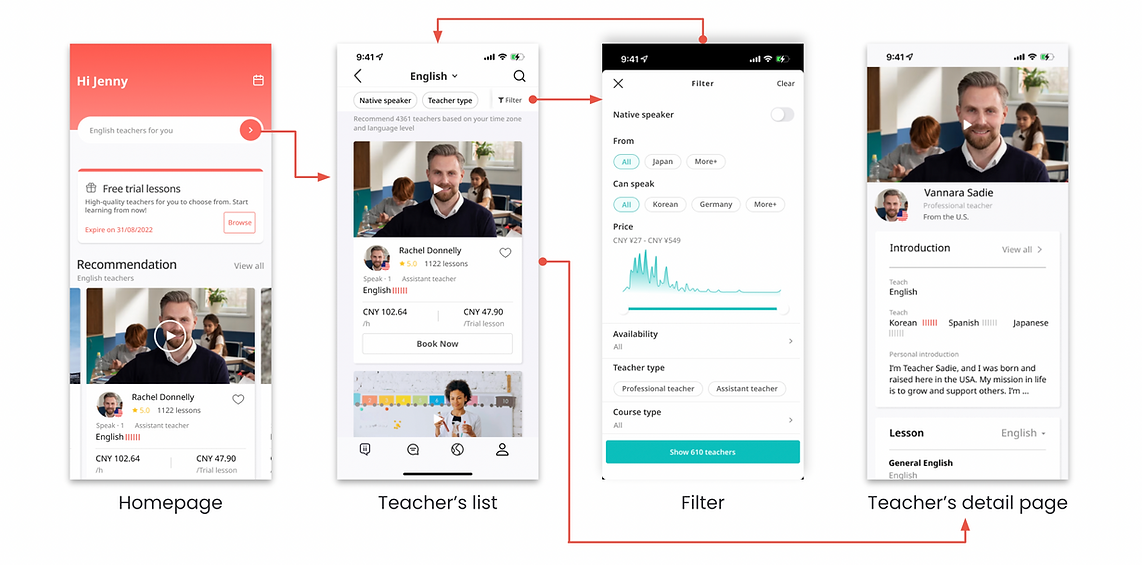
The predesigned task flow of finding a suitable teacher.

Before


-
The promotion card is not eye-catching
-
Too much white space in the card layout
-
No visual hierarchy
-
Superfluous information
-
Too much white space in card layout
-
Swipe interaction limits the displayed amounts
(5 teachers will be displayed on the homepage)
-
Lack of visual and information hierarchy
-
Low contrast
-
Visually eye-catching promotion banner drive conversion of new users
-
Reduce banner size and save more space
-
Discard superfluous information
-
Reduce card size to save more space
-
Re-layout the teacher's card
-
Increase information-carrying capacity
-
Masonry interaction to show more teachers


We were able to improve the component from user feedback
and I was able to create the final design.
Version B


Version A

-
Discard the self-intro video on the homepage
-
Highlight the language the teacher teach
-
Highlight the CTA of Book Trial
-
Summarize the teacher's experience
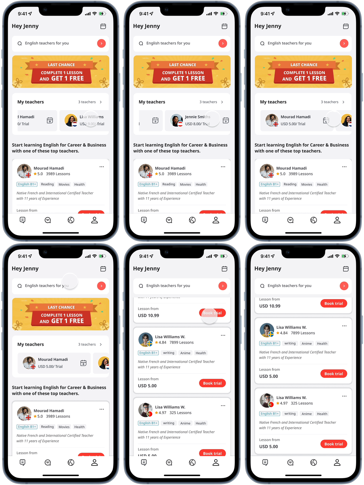


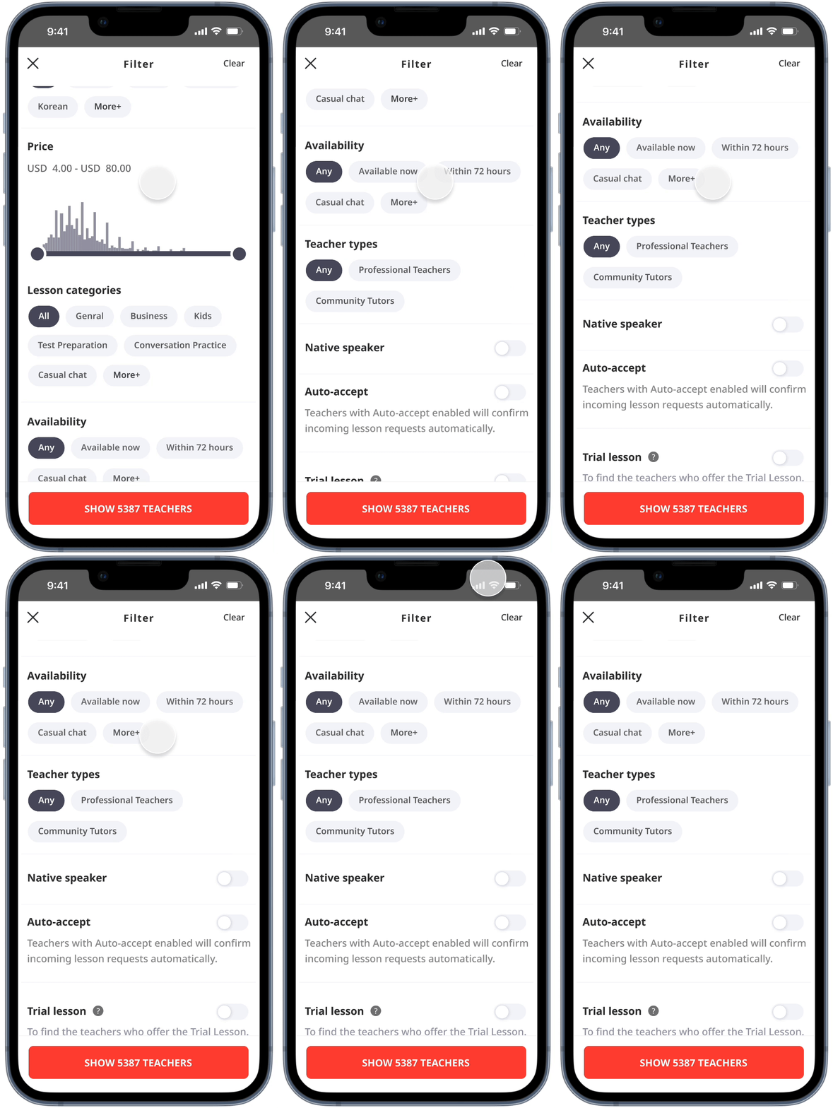


Overall optimization

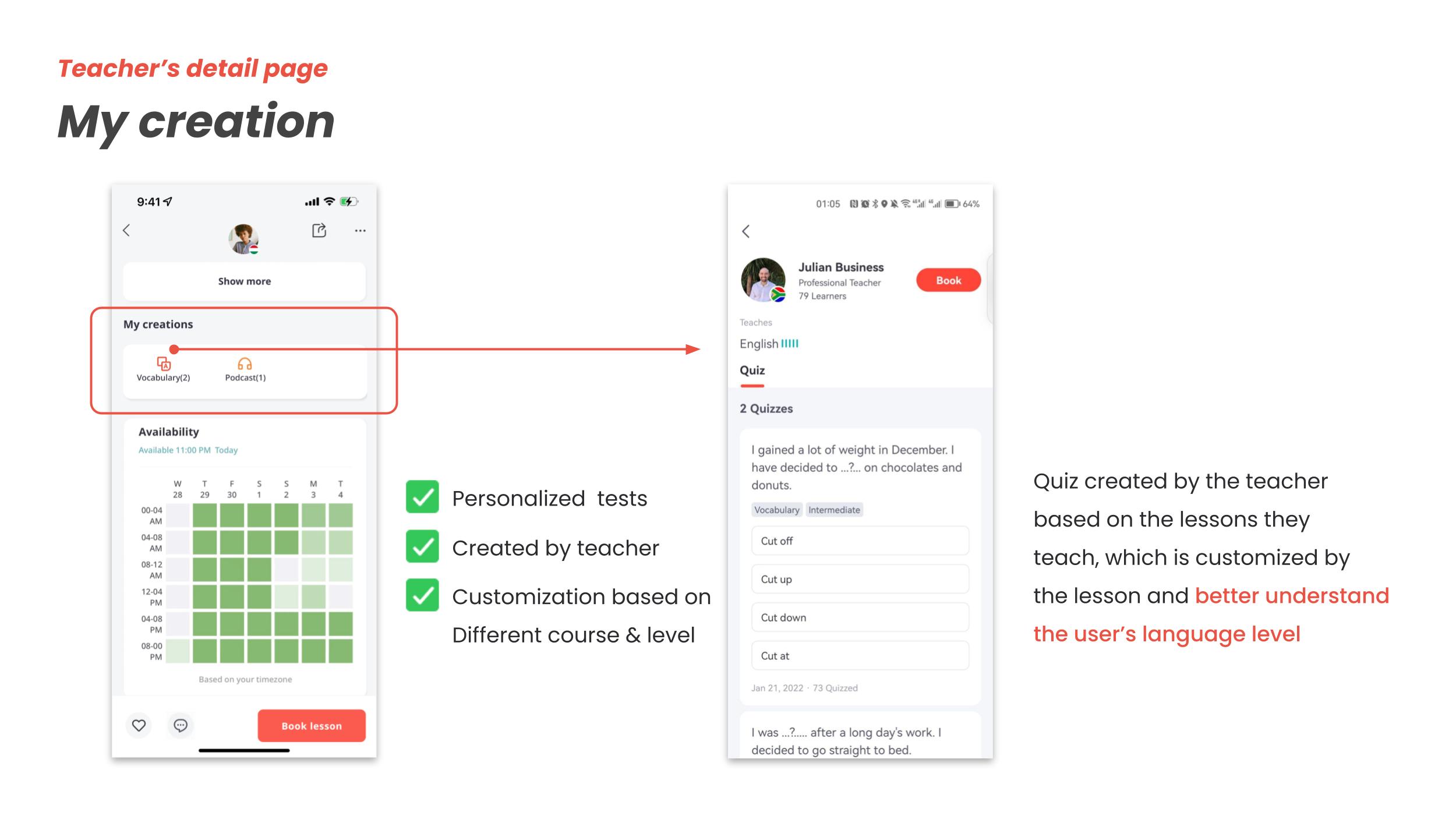
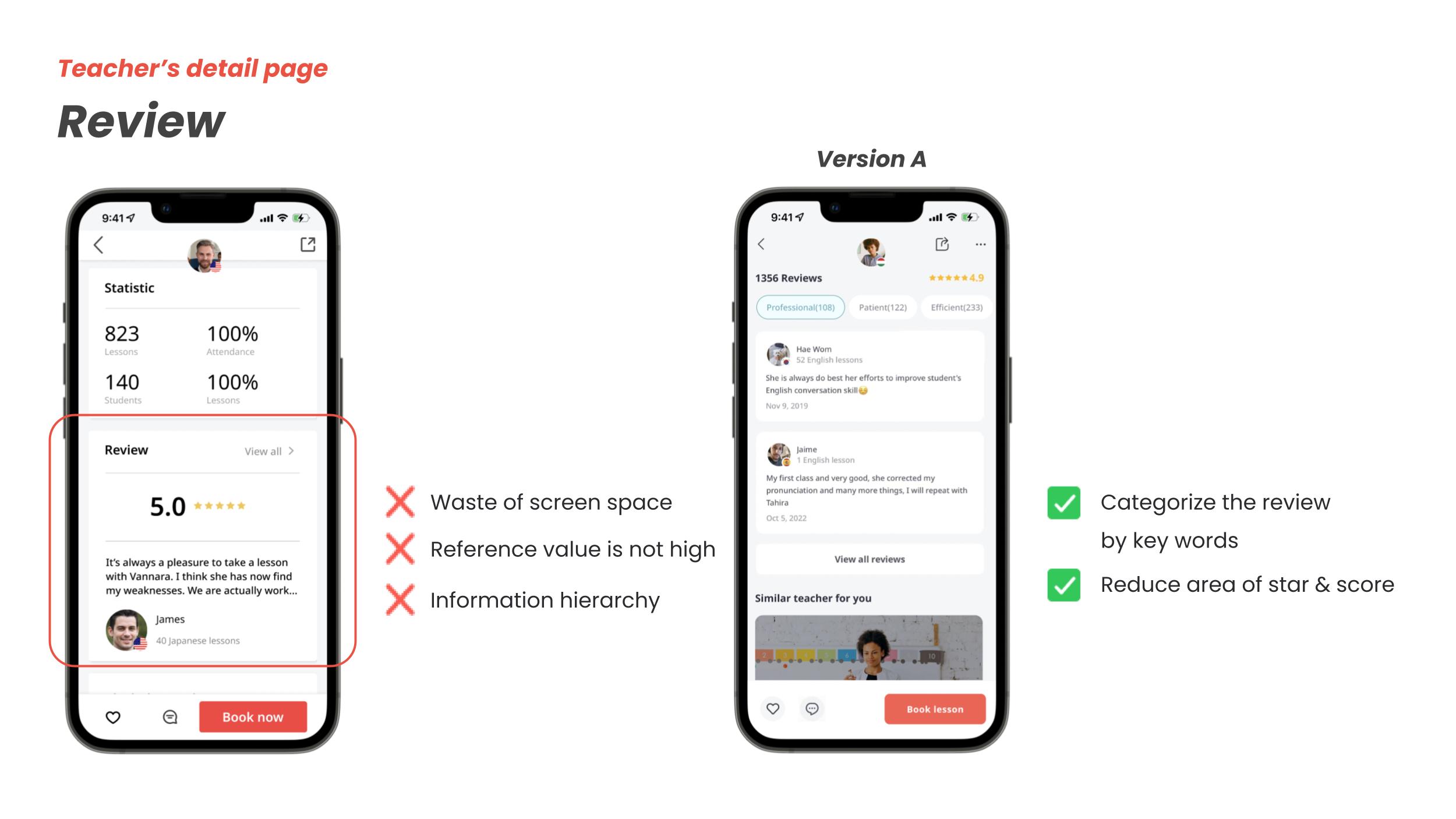
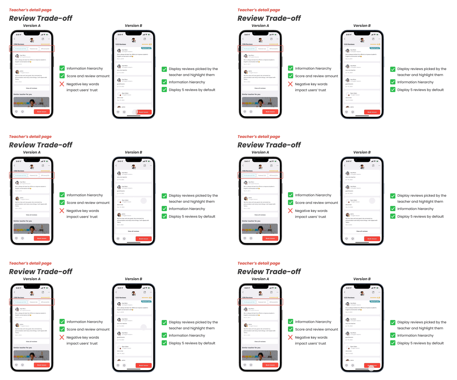
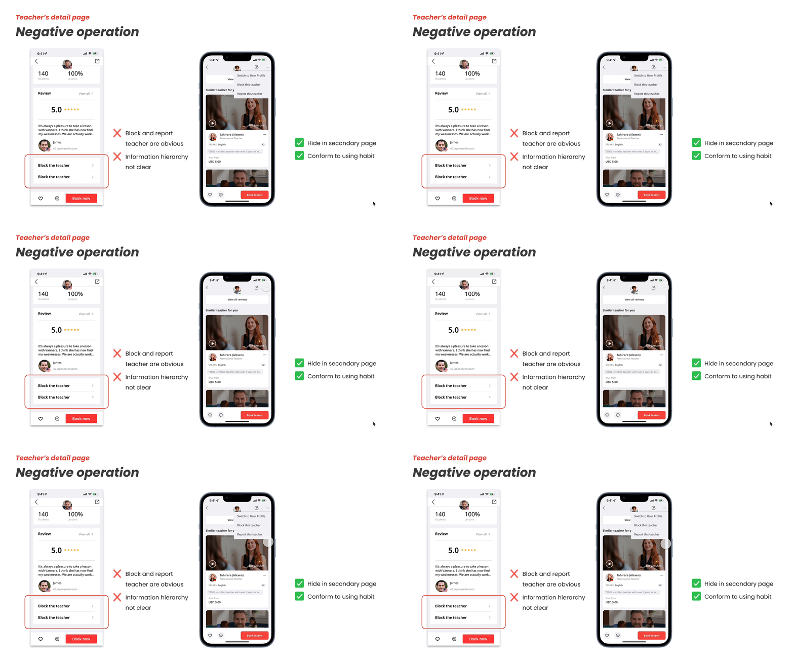
Optimization of each module (Swipe to see full details)
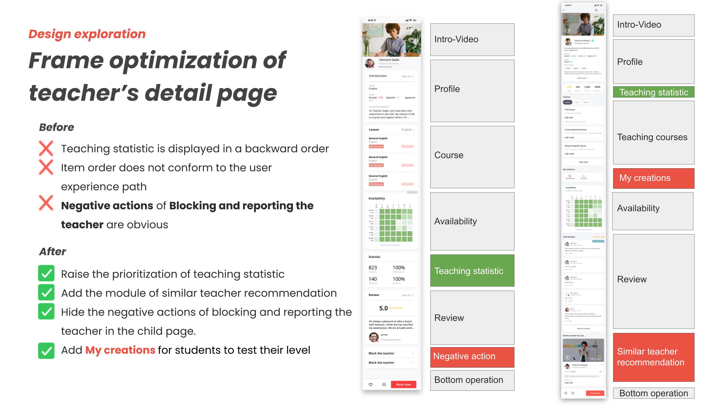
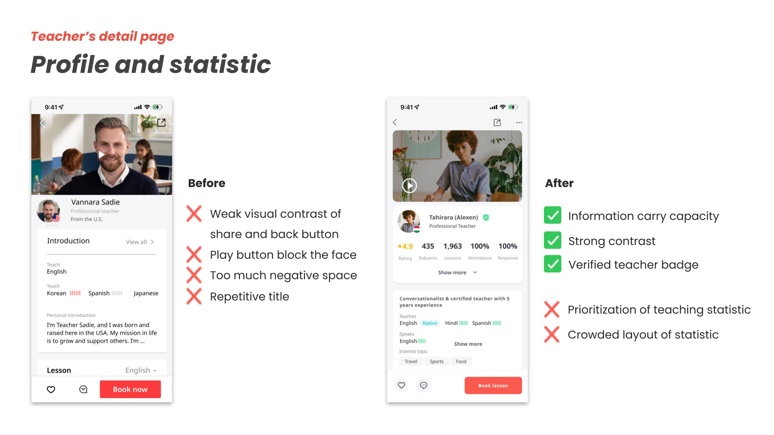
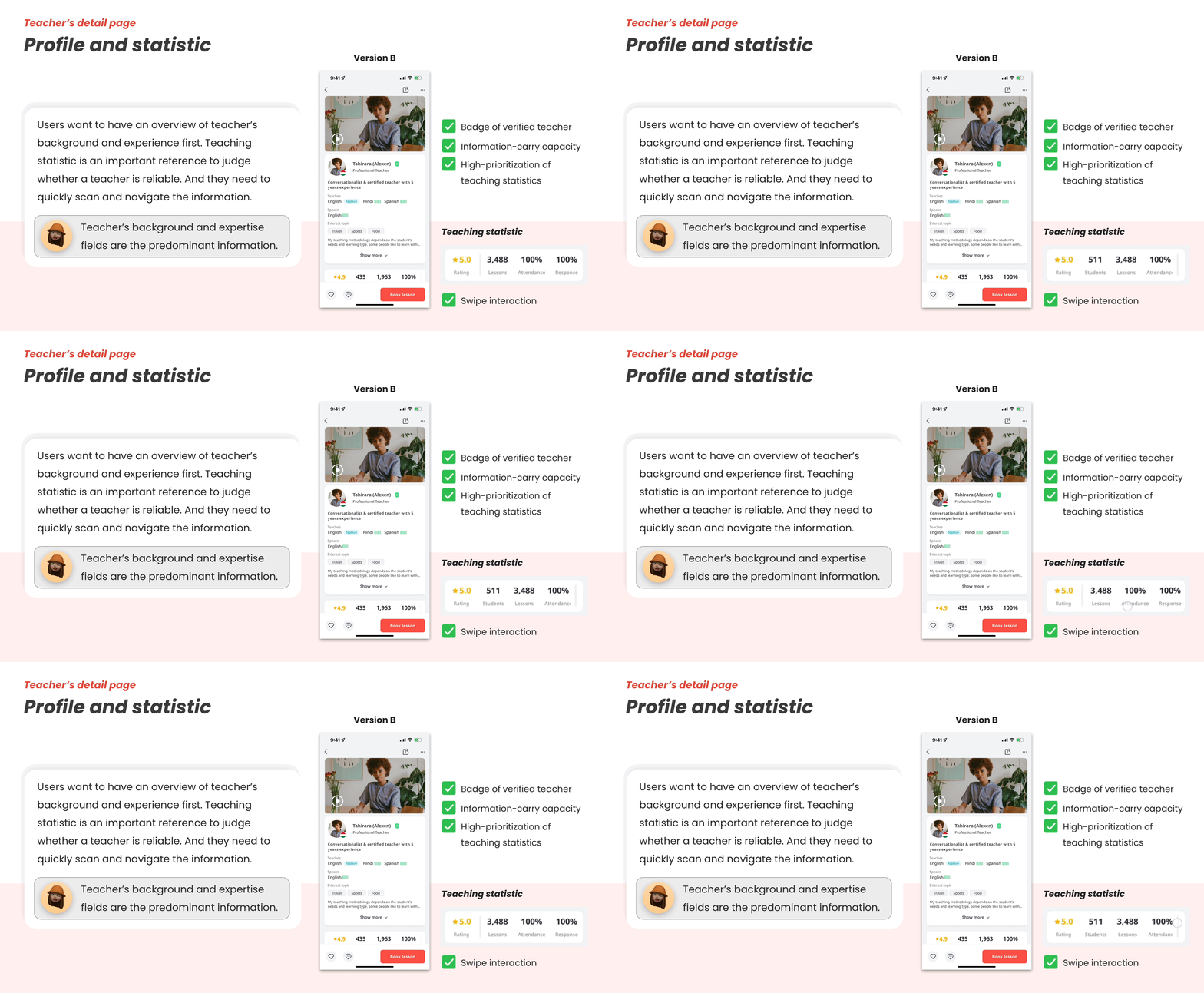
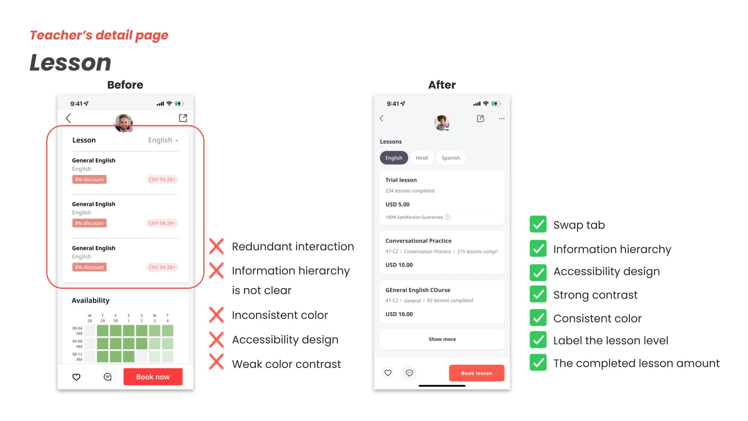
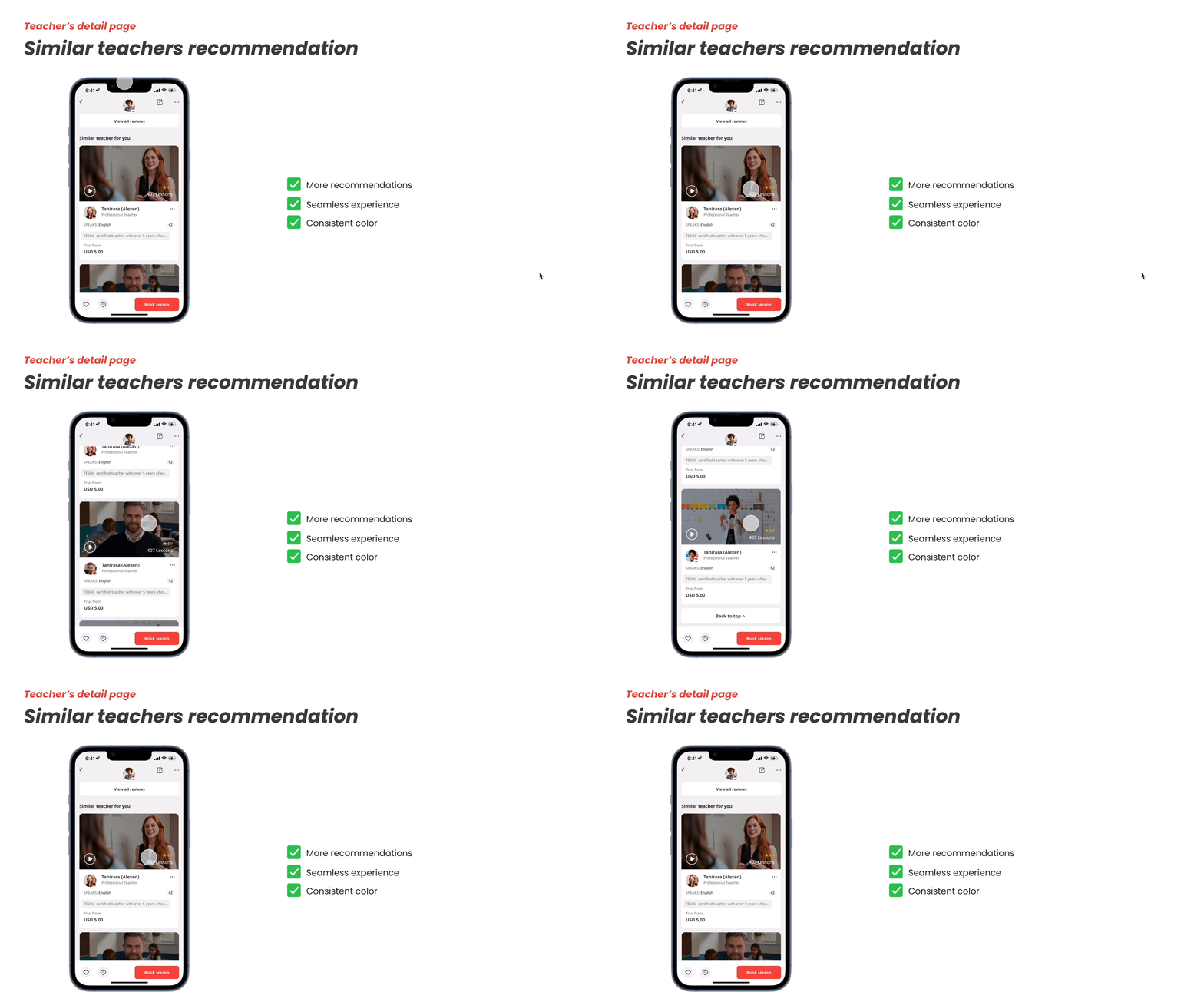


Next step
Optimize the workflow of payment
Generalize the teachers’ video format
Change the promotion banner based on different activities
Add navigation on the detail page
Other projects